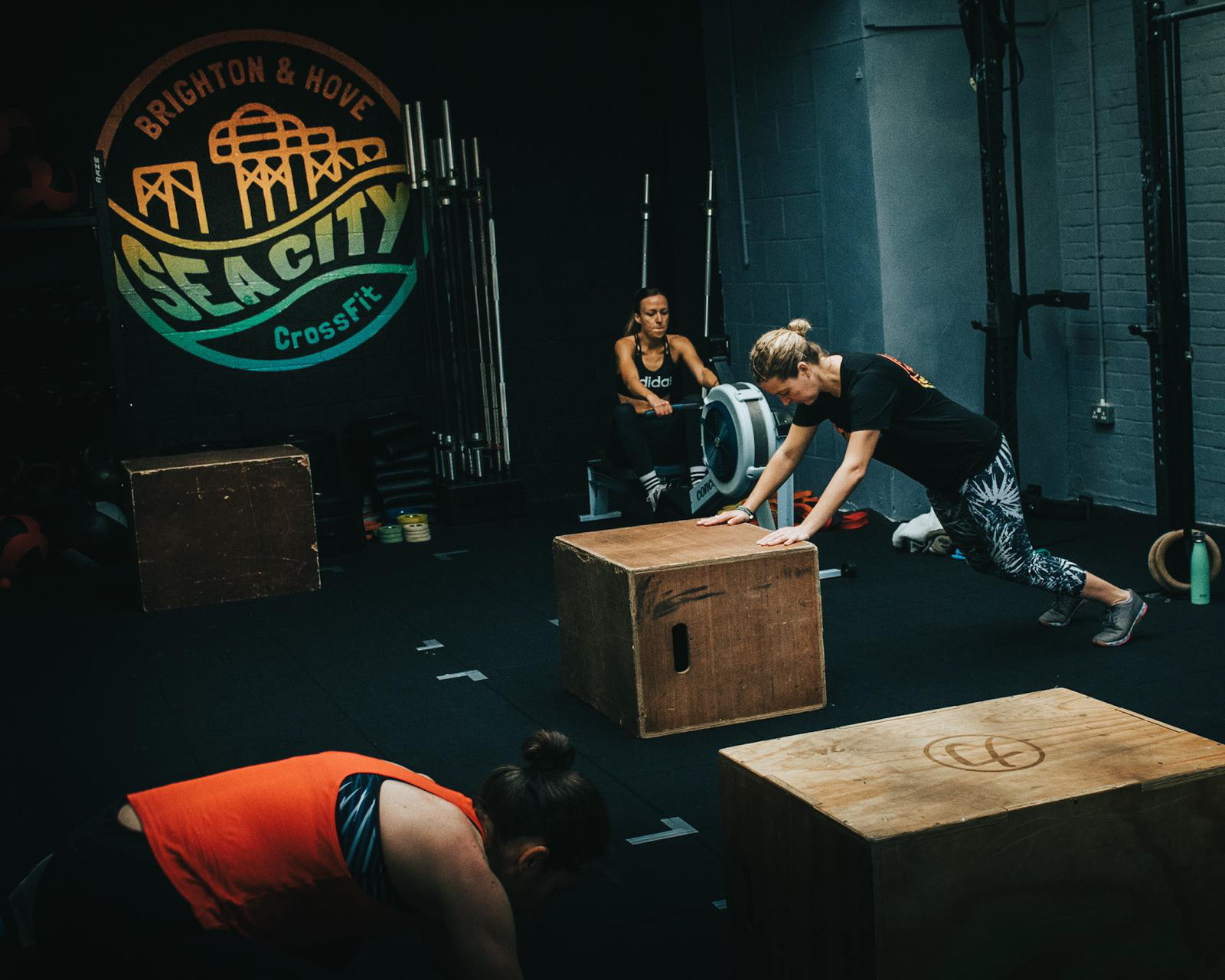
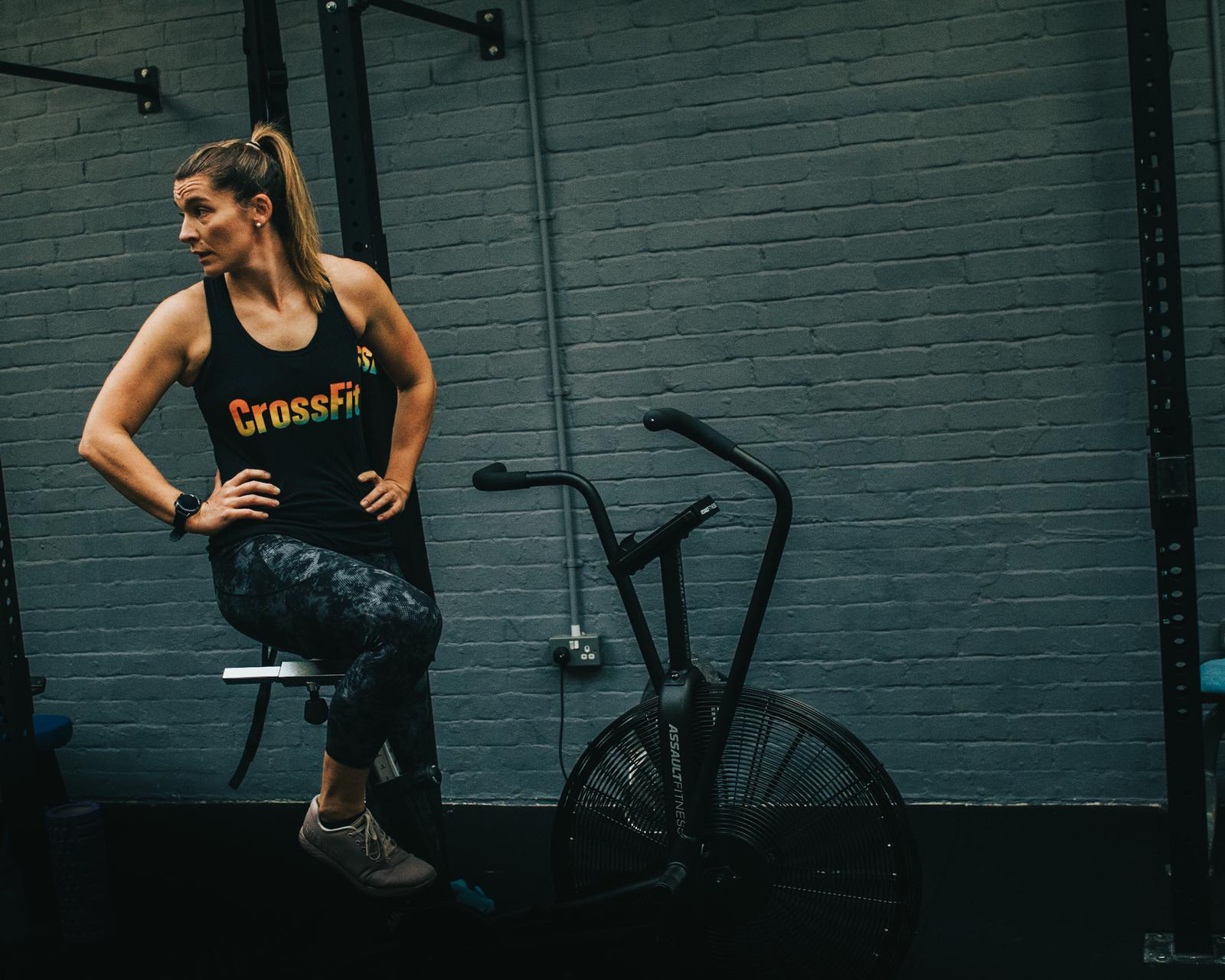
About: Based in Brighton & Hove, Sea City CrossFit is a small gym with a big heart and strong community. They keep their classes small to ensure members get looked after and coached to the highest standards.
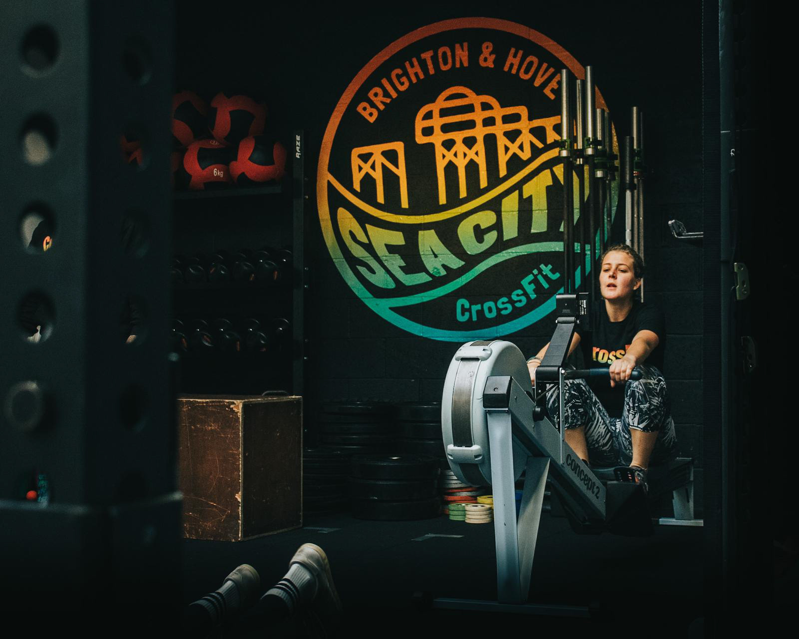
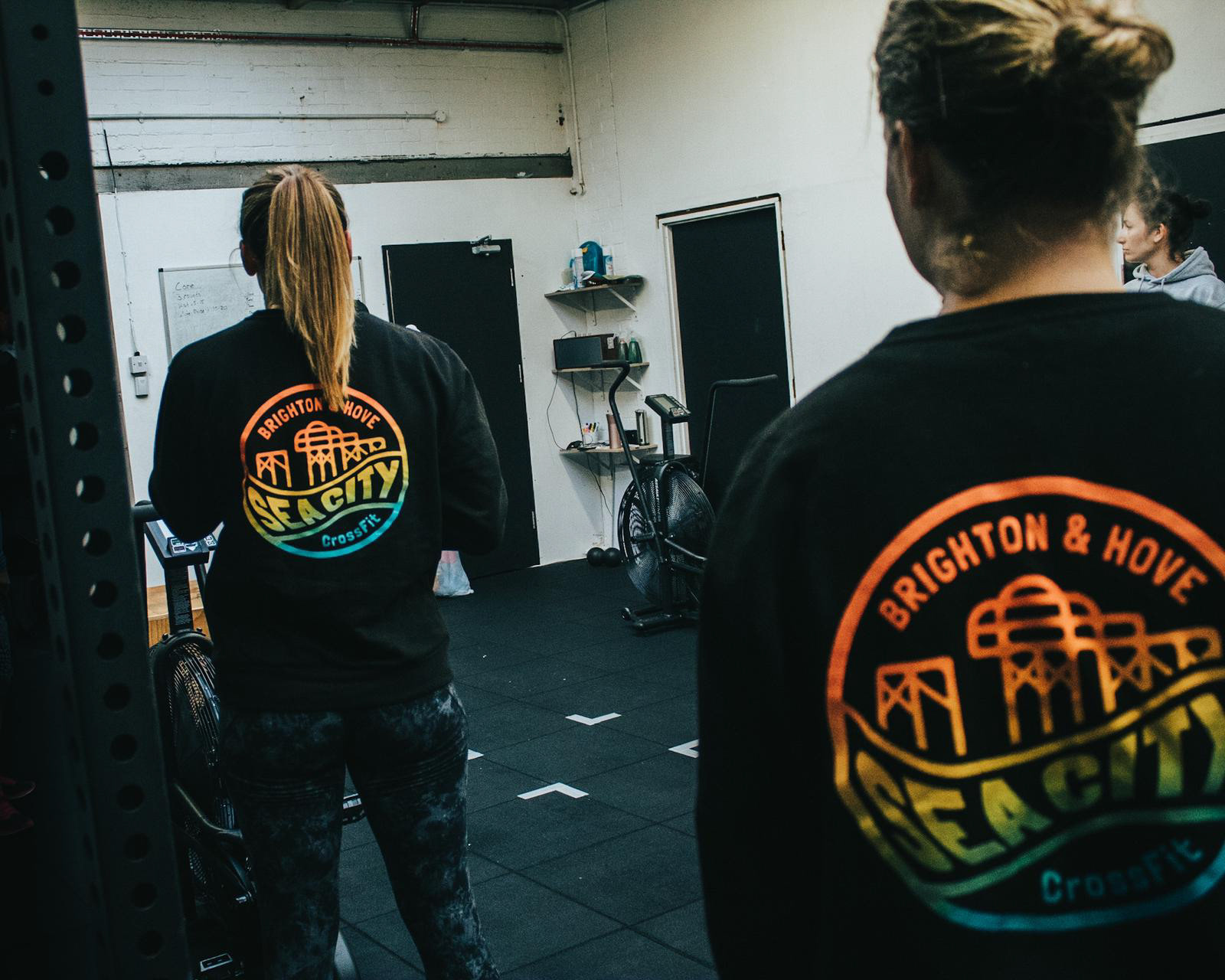
Work: I was asked to design a logo for Sea City CrossFit that defied the “classic” CrossFit logo clichés; no angular badge lockups, no aggressive looking mascots and definitely no dumbbells, barbells, kettlebells (or any other weight icon for that matter) in sight. Essentially, Emma and Dan wanted a CrossFit logo that didn’t look like a CrossFit logo. Drawing inspiration from 80’s and 90’s surf brands, and integrating Brighton’s iconic West Pier, the Sea City CrossFit logo was born.
It was important to Emma and Dan that the logo had a playful and welcoming feel to it. Emma and I sat together to create the gradient in the logo, ensuring it captured the summertime vibes that Brighton & Hove is famous for.


